

A pair of Gadwalls is an excellent example of a familiar North American species, but get the global picture of the range of this bird in Asia and Europe too, along with the remarkable graphics that show their annual migrations and wintering range in addition to their nesting and post-nesting range with reference to abundance along the way (photo by Paul Konrad).
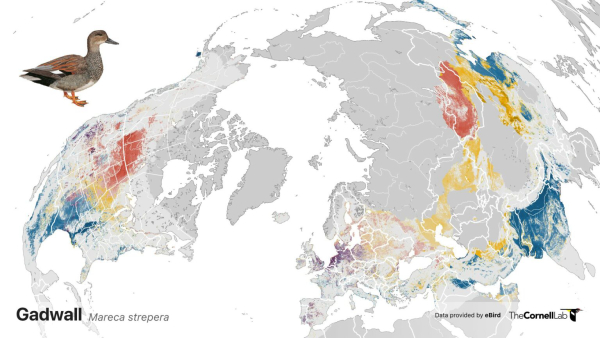
Take a global look at the distribution of Gadwalls and more than 1,000 other species at eBird (illustration by the Cornell Lab of Ornithology).
|
Your eBird data has been put to work again as the annual eBird Status and Trends project has updated the abundance visualization maps that are effectively a week by week range map for each species. This year the team modeled relative abundance for 1,009 species across the globe – including 202 new species. The team used data from more than 300,000 eBirders that included millions of new observations that provide the most up-to-date information on the status and trends of global bird populations including species’ migration routes and wintering sites.
The resulting range maps show the annual movements of the 1,009 species throughout the year, graphically showing the movements of birds from wintering areas, along migration routes, to nesting areas – all within a scale of abundance during their annual cycle. The graphics are amazing and most revealing. It’s great information for birders, biologists, and conservation pros. There’s really only one more thing to do – check out the annual movements of your favorite birds, and many more at Explore all Status and Trends species - eBird
To learn more about the background of how data is used and updated annually, there is a wealth of information provided by eBird at Global Patterns of Bird Abundance and Distribution Revealed for 1,009 Species - eBird